2026 Hottest Trend 3: Shine for Attention. Show for Trust.
In 2026, surface treatment becomes a strategy. As colours grow bolder and compositions more dynamic, finishes are doing more of the heavy lifting. Two directions stand out: high-impact metallics and purposeful transparency.
The Return of Metallic Finishes
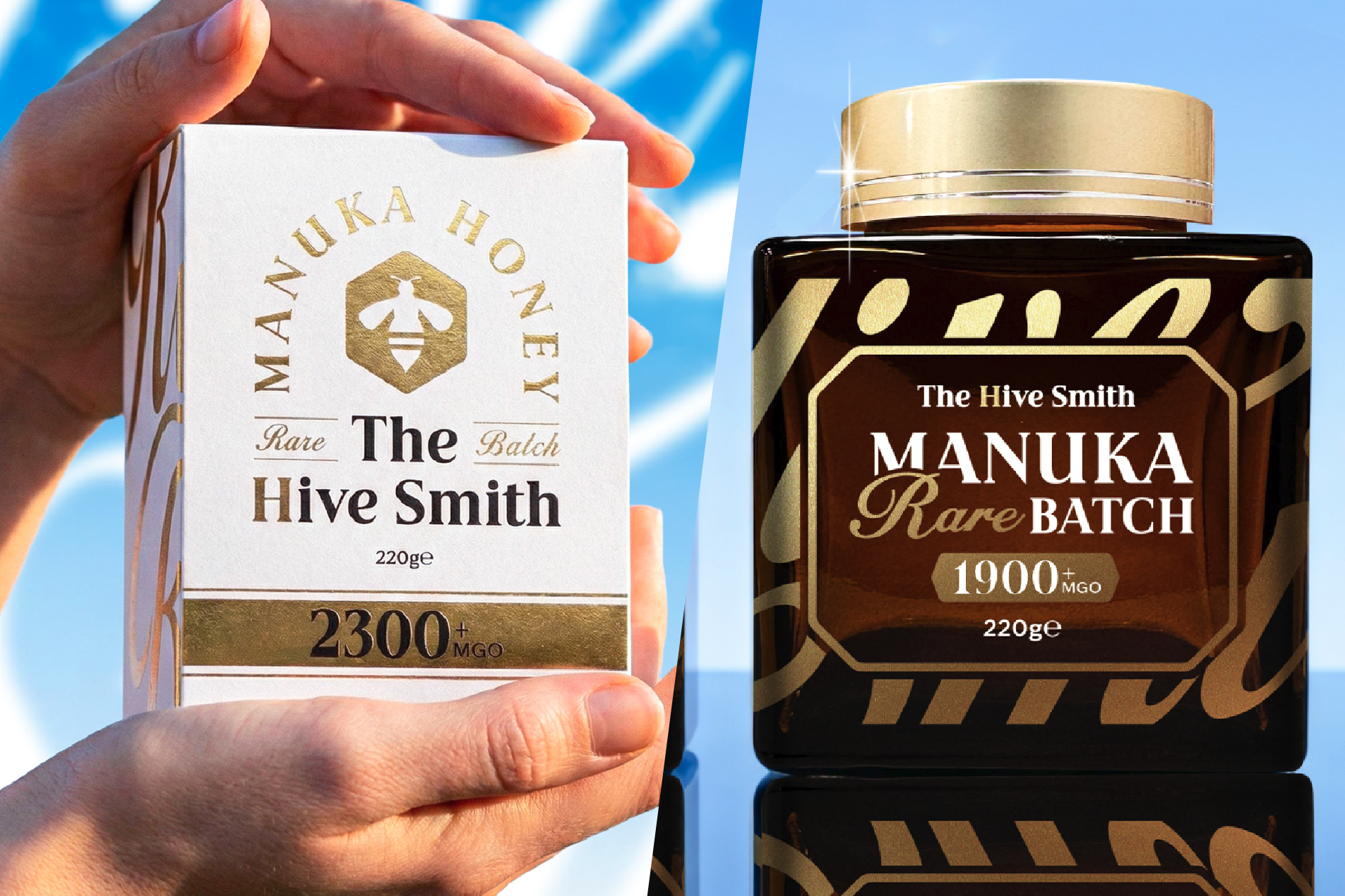
Gold and silver foils, metallic inks and high-gloss stamping are returning with confidence. Think of these finishes as premium armour – not just decorative accents, but intelligent tools for commanding attention. Liquid gold foils and holographic silvers interact with light, allowing the pack to shift and reflect as shoppers move past. From every angle, it catches the eye.
Metallic doesn’t have to mean loud. Shine can be controlled with precision. A single highlighted logo, a name picked out in foil, or a subtle metallic sheen across a pouch can create anything from a quiet shimmer to a bold flash. Used strategically, metallic finishes signal value, strength and modern luxury.
How to Achieve Metallic Effects
This is where many designs lose their impact – not because the idea isn’t strong, but because the print process wasn’t considered early enough or your design lacks print expertise. Metallic finishes don’t just “appear” in production. If the artwork isn’t set up correctly or the handover isn’t clearly communicated, your label can come out looking plain, with no shine or depth.
Understanding how the effect is created helps brands control both aesthetics and budget.
Labels & Carton Boxes
For labels and folding cartons, there are two primary ways to achieve a metallic finish.
1. Print, then Foil Stamp
This is the most common approach. Artwork is printed first, then metallic foil (gold, silver or speciality finishes) is applied using heat and pressure. This method delivers sharp detailing, strong reflectivity and excellent edge definition. It works especially well for logos, typography and precise graphic highlights.
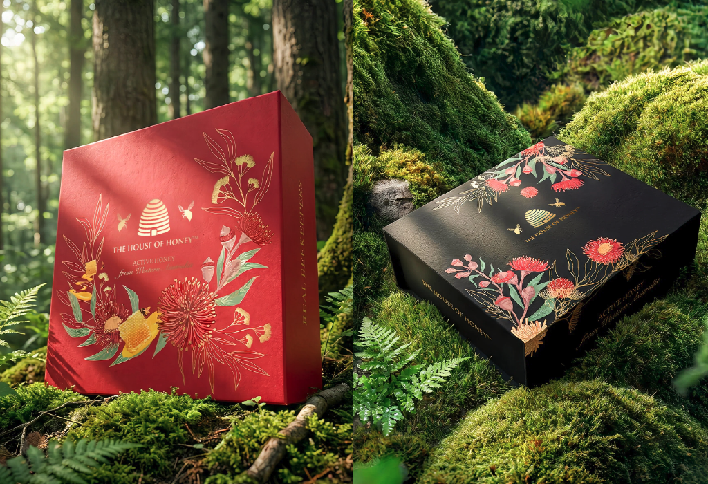
Source: The House of Honey by Thirsty Fox
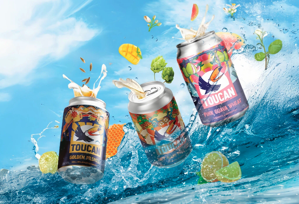
Source: Toucan Brewery
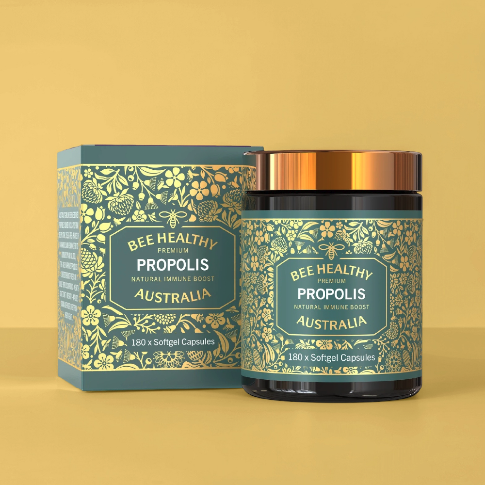
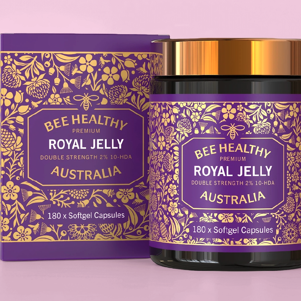
2. Use Silver PP or Metallised Substrates
Instead of adding foil afterwards, the metallic effect can come directly from the base material — such as silver polypropylene (PP) or metallised paper. Designers can then “knock out” areas or print translucent inks to allow the metallic base to show through. This method is cost-efficient and allows for broader metallic coverage across the design.
 |
 |
 |
Source: Bee Healthy Australia
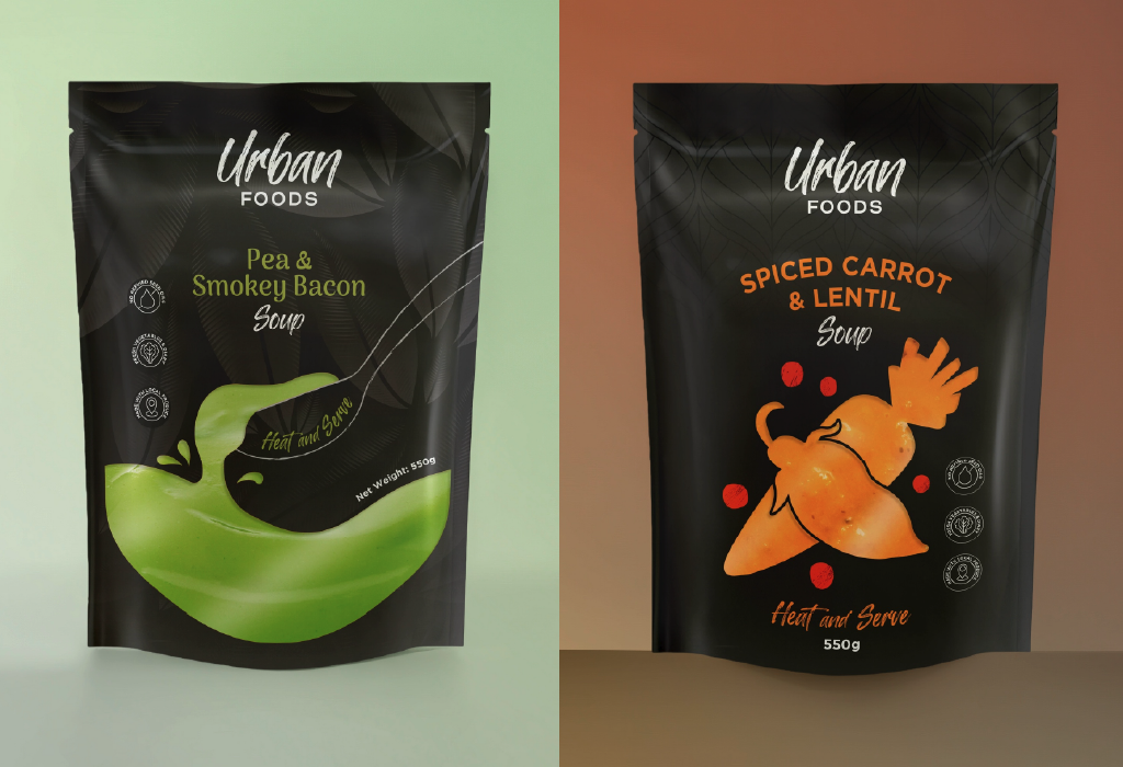
Flexible Packaging (Pouches)
For pouches, metallic effects are often achieved through metallised films combined with strategic white ink control.
By applying different levels of white ink beneath the artwork, printers can control how much of the metallic layer shows through:
- Full white backing blocks the shine completely.
- Partial white creates a softer sheen.
- No white allows full metallic reflection.
This technique enables multiple levels of shimmer within a single design, from subtle glow to bold reflective impact, without adding additional foil processes.
Metallic finishes capture attention through reflection. They catch light, create movement and elevate perceived value, which is why they remain powerful in premium categories.
But 2026 isn’t driven by status alone. The brands that perform best understand when to shine and when to show.
As consumers become more ingredient-aware, sustainability-conscious and sceptical of over-designed packaging, transparent or clear material is another direction that is gaining equal momentum
See-Through Strategy: Product Visibility Builds Trust
Nowadays, consumers spend significantly longer reviewing packaging details than they ever did before. The decision is made more carefully, shoppers flip packs over to read labels and question sourcing. That’s when visibility becomes a strategic signal.
If metallic is about commanding the spotlight, transparency is about proving what’s inside. Clear windows and translucent materials are being used more deliberately, integrating the product itself into the design.
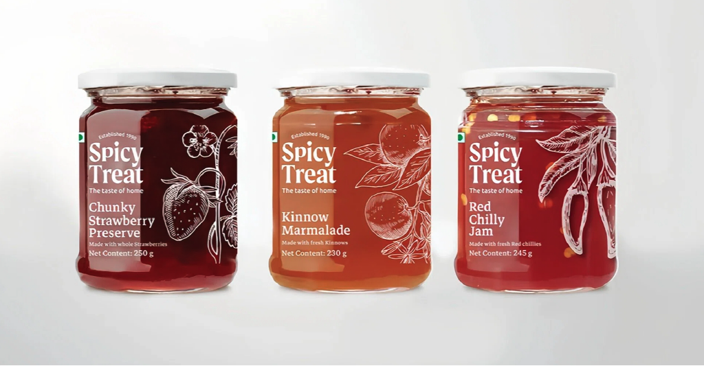
This “what you see is what you get” approach works especially well in categories where visual quality matters: confectionery, snacks, honey, dried fruits and natural products.
Instead of hiding the contents, the packaging frames them. Natural colours, texture and consistency become the hero, turning the product into the most compelling graphic element on the shelf.
How to Achieve Clear Effects
Labels
For labels, the most effective approach is using clear PP (polypropylene) on a clear container. When executed properly, the label visually disappears, allowing the product inside to become the hero.
The real power lies in white ink control.
Areas without white remain transparent, while selected white backing creates opacity for logos, typography or key information. But not all white perform the same. If the white ink isn’t strong enough, or not built up to the correct density, it can look dull, greyish or weak against the clear material. To achieve crisp, standout graphics on transparent substrates, you need properly layered, high-opacity white. Precision here determines whether the design feels premium or compromised.
Clear-on-clear execution also demands attention during application. Transparent labels reveal everything, including air bubbles, misalignment or uneven pressure. Without the right applicator settings and surface preparation, small imperfections become highly visible.
In transparent packaging, nothing hides. That’s exactly why both artwork setup and application accuracy matter.
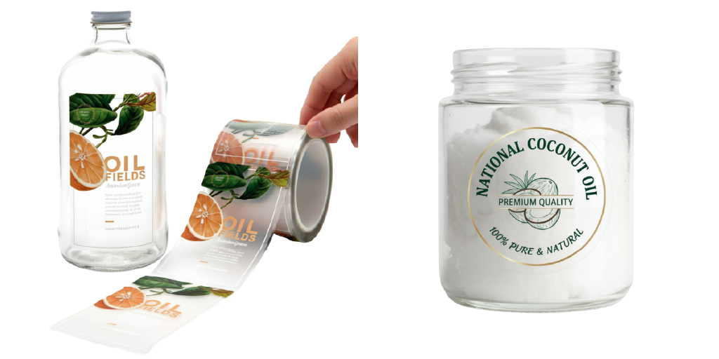
Source: National Print
2. Flexible pouches
Clarity in pouches depends heavily on white ink control. Areas without white remain fully transparent. Strategic white backing blocks transparency where opacity is needed for logos, typography or key information.
The real opportunity lies in how you design the window.
A clear window doesn’t have to sit passively at the bottom. It can be integrated anywhere on the pouch – front, back or even along the side gussets in a box-bottom structure. More importantly, the window can become part of the graphic language.
Instead of cutting a generic shape, brands can turn meaningful elements into transparent features. For example, Thirsty Fox transformed the bee from The House of Honey’s logo into a functional window, allowing the honey inside to become part of the design. For LivloNG, a tea brand in Africa, a section of the “Big Five” animal illustration or a tea leaf silhouette becomes the clear window, revealing the product through storytelling rather than a standard cut-out.
In these cases, transparency is no longer a technical feature. It becomes narrative.
Technically, achieving this effect requires careful white layering. Too little white and the structure weakens visually. Too much and the transparency loses impact. Balance determines whether the result feels premium or patchy.
This approach is especially powerful for food categories, like snacks, dried fruit, tea, honey and granola, where texture and natural colour build immediate trust. When customers can see the product clearly, claims become less necessary.
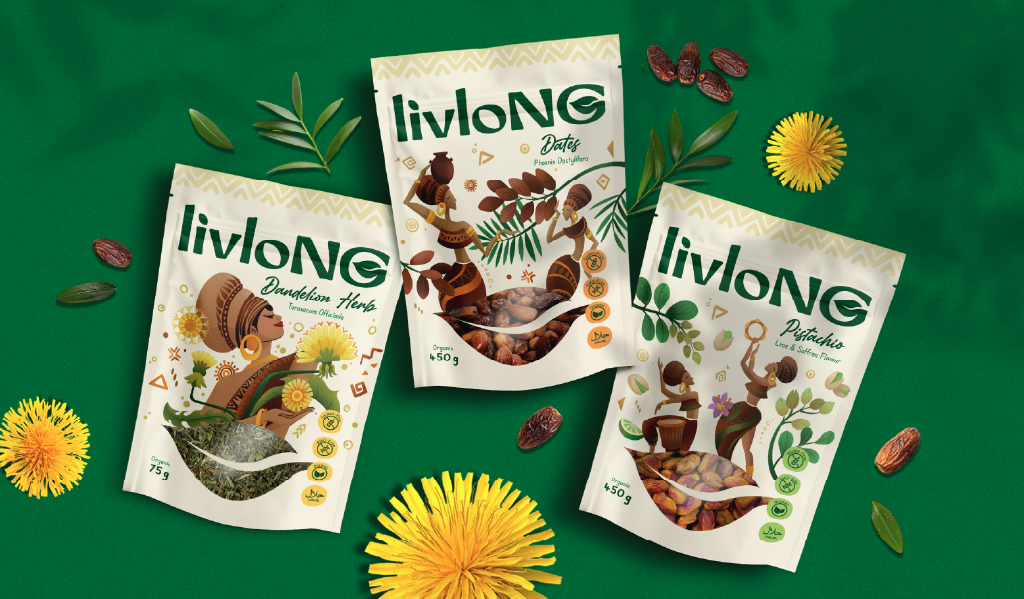
Source: LivloNG Herbal Tea Packaging by Thirsty Fox
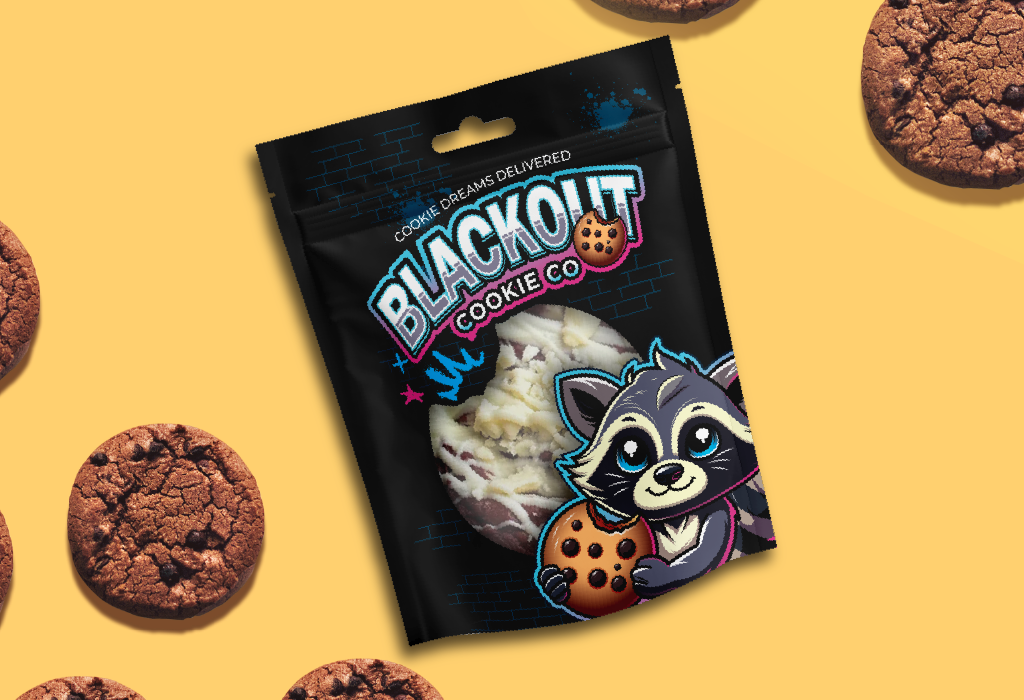
Source: Blackout Cookie Co Packaging Design by Thirsty Fox
Finishing matters
Surface finish changes how transparency is perceived.
Matte lamination diffuses light. It creates a soft, velvety surface that feels premium and refined. However, when applied over transparent areas, it produces a frosted effect. The window becomes hazy, reducing clarity and limiting how clearly the product inside can be seen.
In categories where texture and natural colour build trust, such as snacks, dried fruit, tea or granola, that loss of visibility can weaken the impact of having a window in the first place.
Source: Blackout Cookie Co Packaging Design by Thirsty Fox
Gloss lamination, on the other hand, maintains sharp clarity. It enhances visibility, strengthens colour vibrancy and keeps the product clearly visible through the window. While some brands associate gloss with being “less premium,” in transparent packaging it often becomes essential if product visibility is the goal.
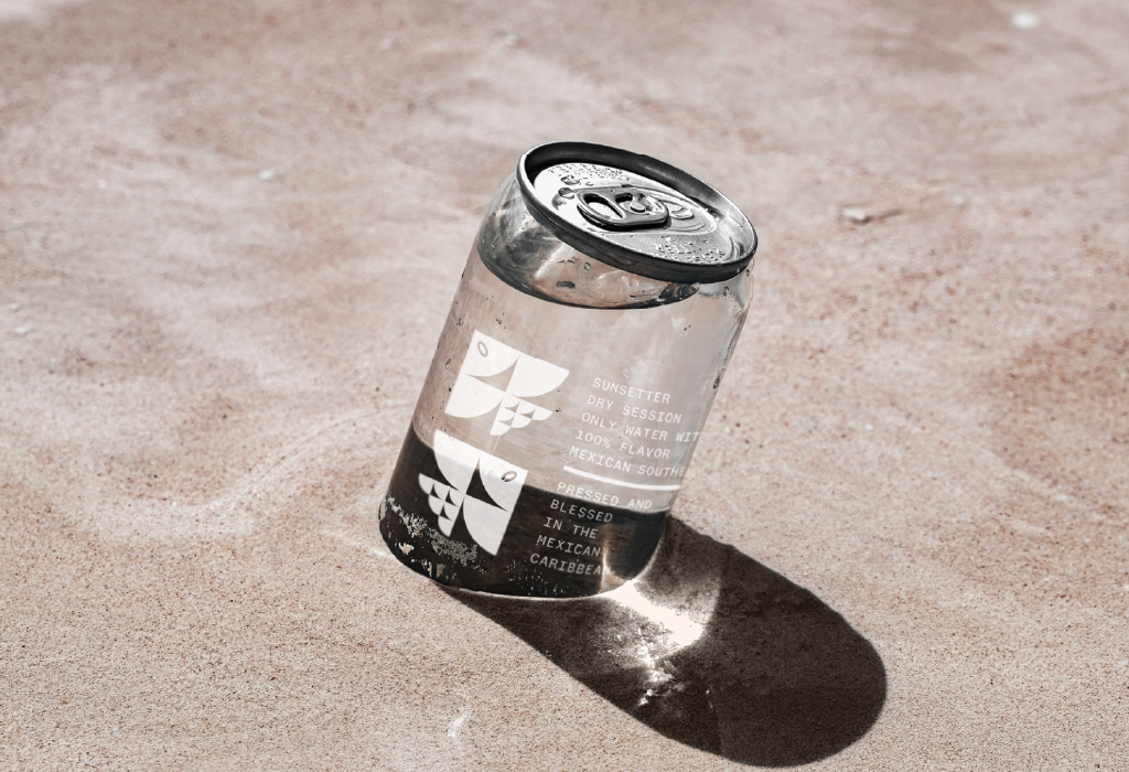
Source: Amar Caribe design by Enrike Puerto
The key is alignment.
If your strategy is tactile refinement, matte may support the overall feel — but you might selectively avoid coating the window area. If your priority is clarity and trust, gloss becomes a functional decision rather than an aesthetic one.
Where design meets execution
Transparent packaging looks simple. In reality, it’s one of the most technically demanding formats. White ink must be dense enough to stay crisp on clear substrates. Opacity needs to be controlled so logos feel solid rather than washed out. Windows must align perfectly with the structure. Finishes must enhance clarity, not distort it.
At 3P Systems and QLM Group, our advanced digital technology allows us to produce high-opacity, premium white with precision and durability. Over 50 years, we’ve worked with multiple brands across the APAC region, delivering clear labels and flexible packaging that maintain clarity, adhesion and performance in real retail environments.
But production excellence alone isn’t enough.
Transparent materials require thoughtful design from the start. At Thirsty Fox, we develop packaging systems that intentionally integrate clear elements – turning windows into storytelling devices, balancing opacity with visibility and ensuring the material choice strengthens the brand concept rather than complicates it.