The Return of Human Touch in Labels & Packaging Design
When a clean and polished design is easy to achieve, what actually stands out? For some brands, the answer isn’t more gloss. It’s more character.
As AI makes visual production faster and more accessible, some brands are leaning into what technology alone cannot replicate: material presence, personal story and lived experience. In specialty coffee, craft spirits and premium food, packaging isn’t just carrying information anymore. It’s carrying identity. The examples below highlight how texture, origin and personality are shaping packaging in 2026.
Source: thethirstyfox.com
Bringing character back into packaging
For coffee roasters, kombucha brewers, artisanal sauce makers and craft distillers, this ‘trend’ is refreshingly simple: your packaging should feel made, not manufactured.
Where machine-generated visuals emphasise symmetry and flawlessness, this direction celebrates warmth and texture.
Imprinted finishes such as embossing, debossing and letterpress introduce subtle variations that signal human involvement. Ink may appear slightly uneven. Lines may carry natural irregularities. Typography leans toward rough serifs, stamped graphics or typewriter-inspired forms arranged in organic layouts.
These details are not mistakes. They are signals of craft.
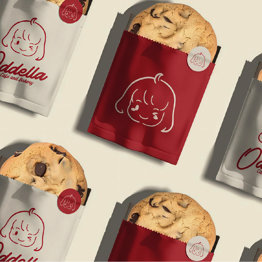
Character-driven packaging, like Mikkeller’s illustrated cans, shows how personality can anchor recognition on the shelf. The illustration isn’t an add-on. It becomes the brand.
 |
 |
Source: cosmos.so | the-brandidentity.com
Loose typography and subtle print finishes soften the overall look, creating a fun, inviting feel for F&B products.
 |
 |
 |
|
Source: pinterest.com | www.latimes.com | thethirstyfox.com
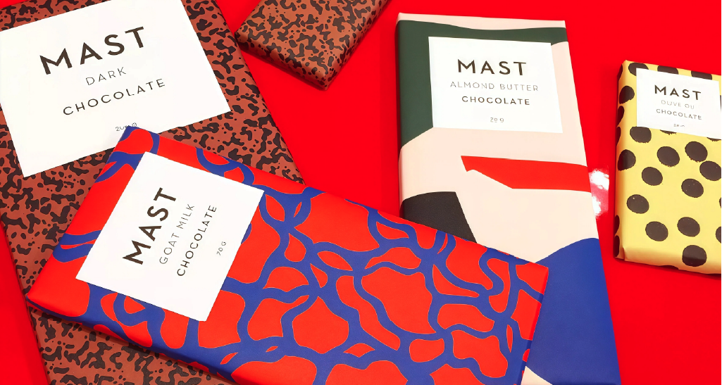
Mast Brothers Chocolate — Rough Typography & Visible Grain
Blind embossing and tactile materials add depth that cannot be replicated digitally. These details create a pause and invite interaction.
Why this sells
When a label feels tactile, shoppers are more likely to pick it up. And once something is in someone’s hand, the dynamic changes.
Engagement increases. So does the likelihood of purchase.
For smaller brands competing against multinational FMCG players, that pause can be powerful. Imperfection signals authenticity. Authenticity builds trust. Trust supports premium pricing. In 2026, “perfectly imperfect” isn’t a compromise. It’s a conscious positioning choice.
When one’s origin and identity tell a story
Texture is one layer. Story is another.
Beyond finishes, many brands are placing founder identity and origin at the centre of their packaging systems.
Instead of leading only with specifications or claims, they’re asking something deeper: who made this, where does it come from, and why does it matter?
For specialty coffee brands, that might mean bringing farmer partnerships and origin stories to the front of pack. For craft spirits, it could centre on the distiller’s philosophy or the thinking behind a limited release. For bean-to-bar chocolate makers, cacao sourcing and ethical relationships often become the visual focus.
The packaging starts the conversation before the seal is even broken.
Source: thethirstyfox.com
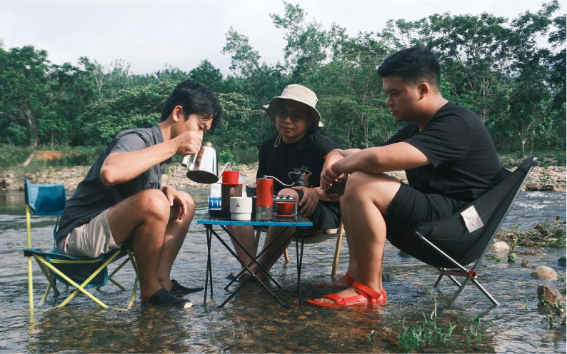
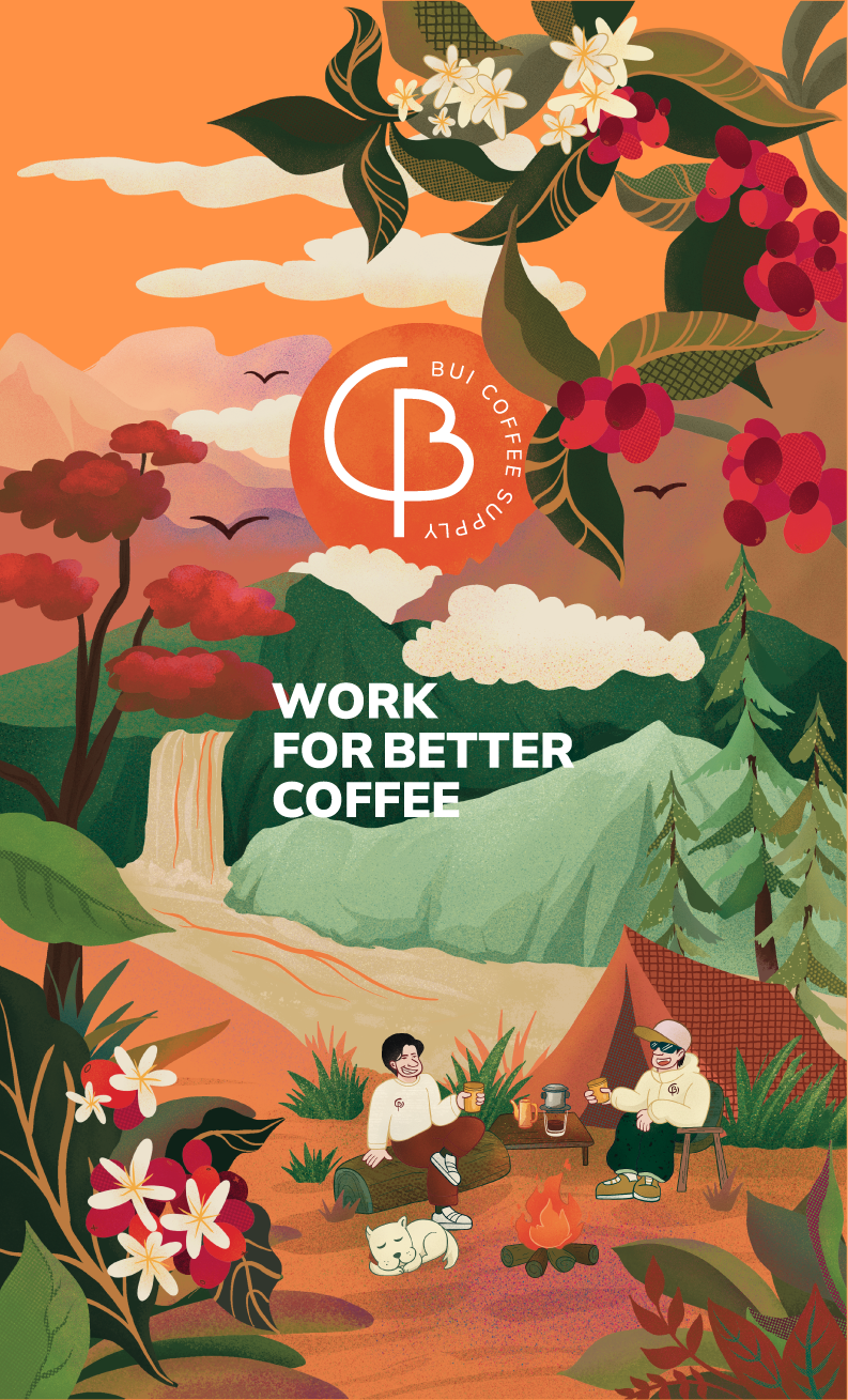
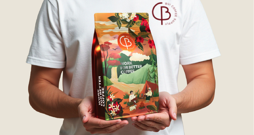
Bui Coffee Supply’s illustrations capture both its origin in Lam Dong and the founder’s joy in brewing coffee by the campfire. It feels grounded in place rather than trend.
 |
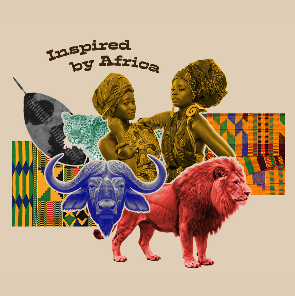 |
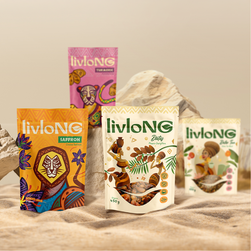
Source: thethirstyfox.com
livlonNG’s packaging draws on heritage-inspired motifs and bold colour systems to communicate cultural identity and wellness.
 |
|
 |
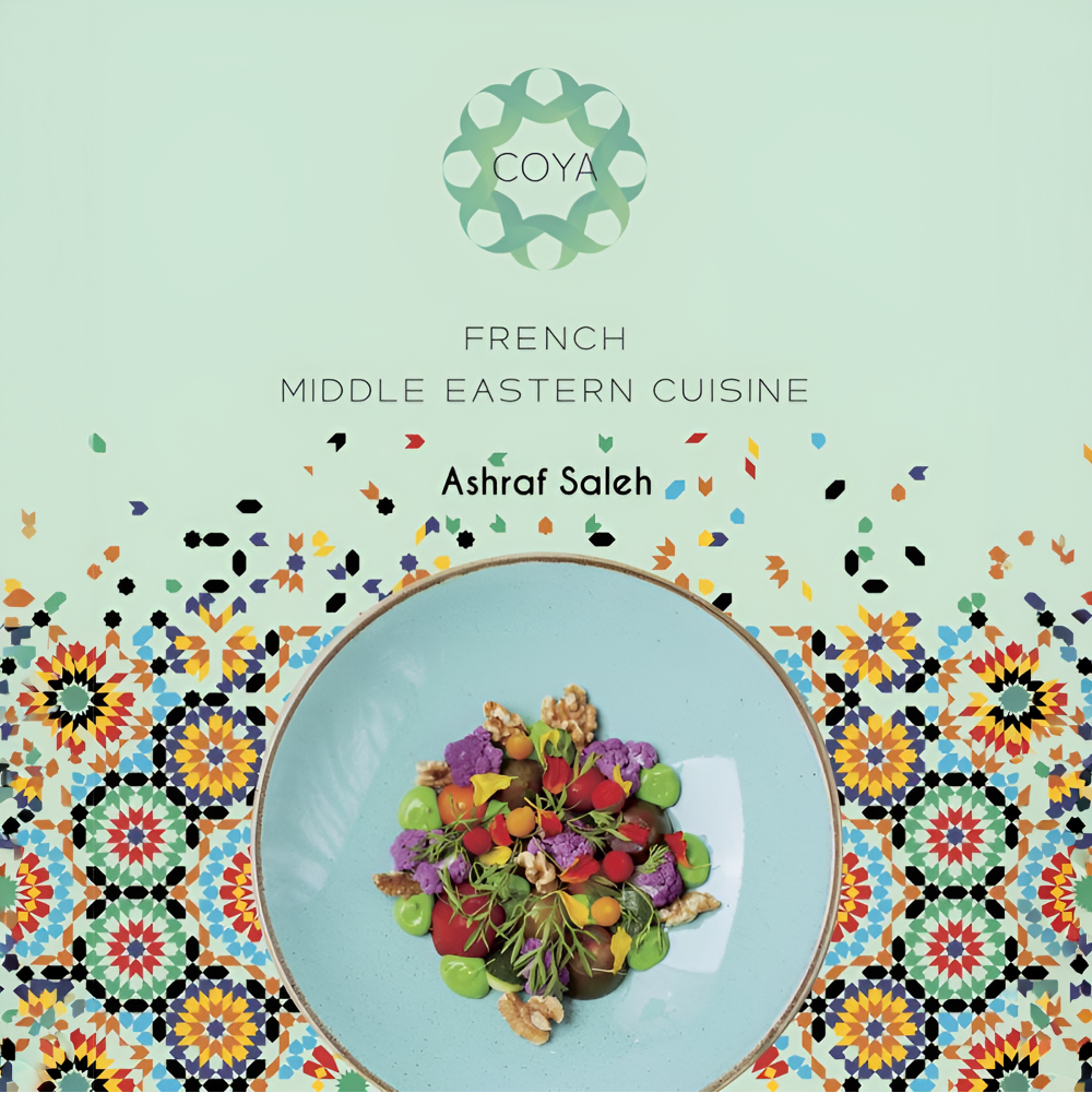 |
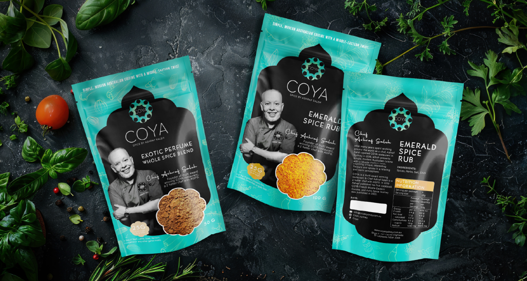
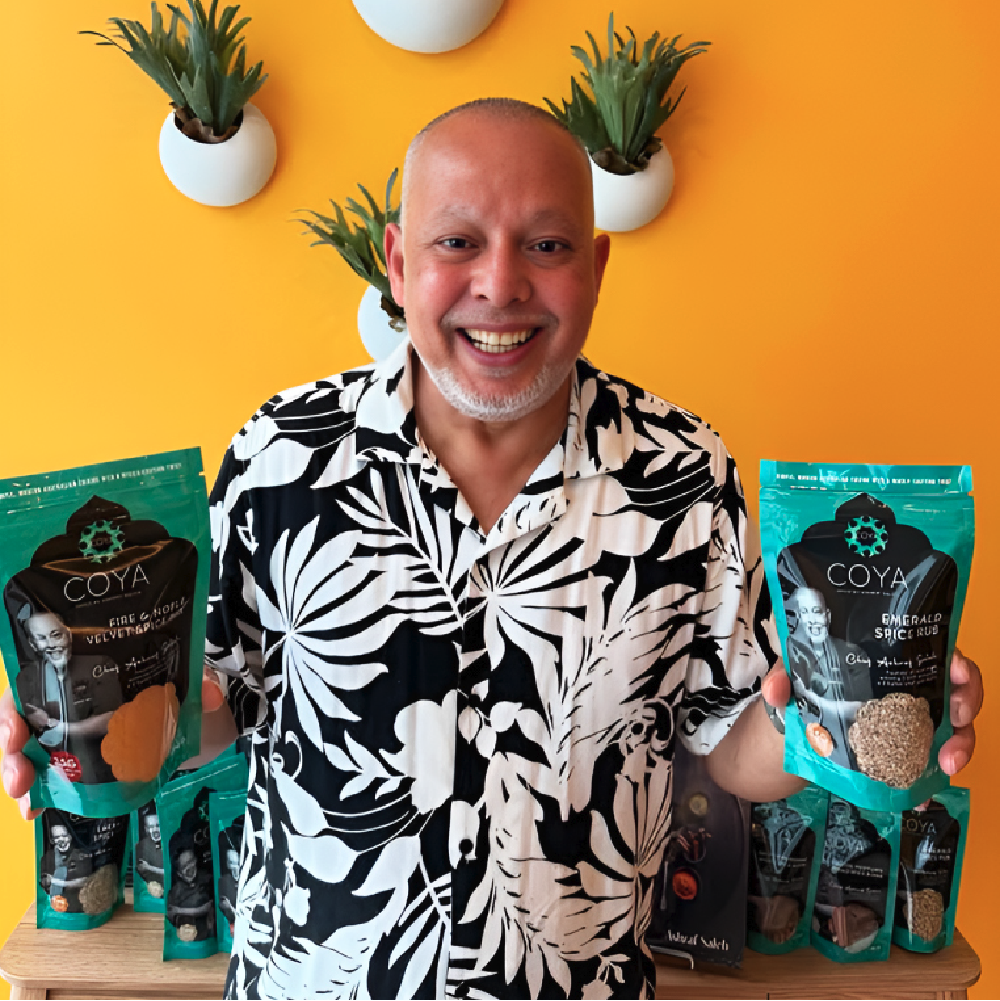
Source: thethirstyfox.com
Coya’s places the chef and his culinary philosophy at the heart of the brand system. Cultural patterns, colour and portrait photography reinforce authenticity. It feels lived, rather than manufactured.
 |
|
 |
 |
Source: thethirstyfox.com
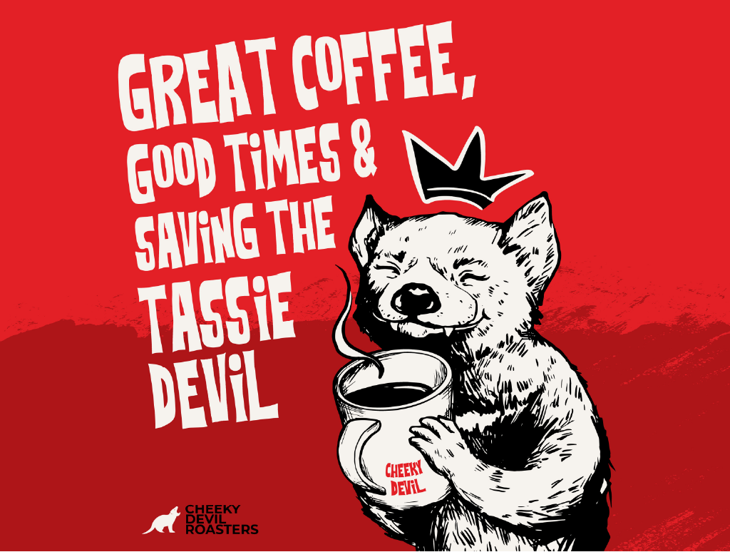
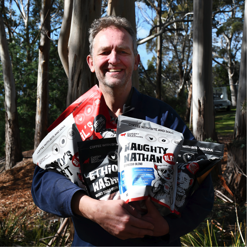
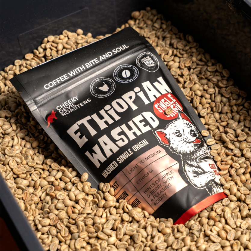
On an even more personal level, Cheeky Devil Coffee Roasters builds its entire product range around family. Each blend carries the name of one of the owner’s children. The story is not layered onto the pack. It is embedded from the beginning.
These aren’t superficial storytelling tactics. They are positioning tools.
Why this works for growing brands
In premium categories, perceived value is influenced by more than ingredients or specifications.
Packaging helps communicate intent, care and differentiation.
For smaller brands competing with larger FMCG players, personality and authenticity are practical advantages. While large brands compete on distribution and scale, SMEs compete on clarity of identity and depth of story.
Texture, founder presence and cultural references make packaging more memorable. They also support pricing power and reduce reliance on discounting.
In a market saturated with highly polished visuals, character and context help products stand out.
The commercial impact of human-centred design
Human-centred packaging is not about rejecting technology. It is about using design decisions strategically.
When packaging reflects real people, real places and deliberate material choices, it builds trust.
For businesses, that trust can translate directly into stronger shelf presence and repeat purchase.
Ready to bring more personality into your packaging? Get in touch and let’s shape it together.