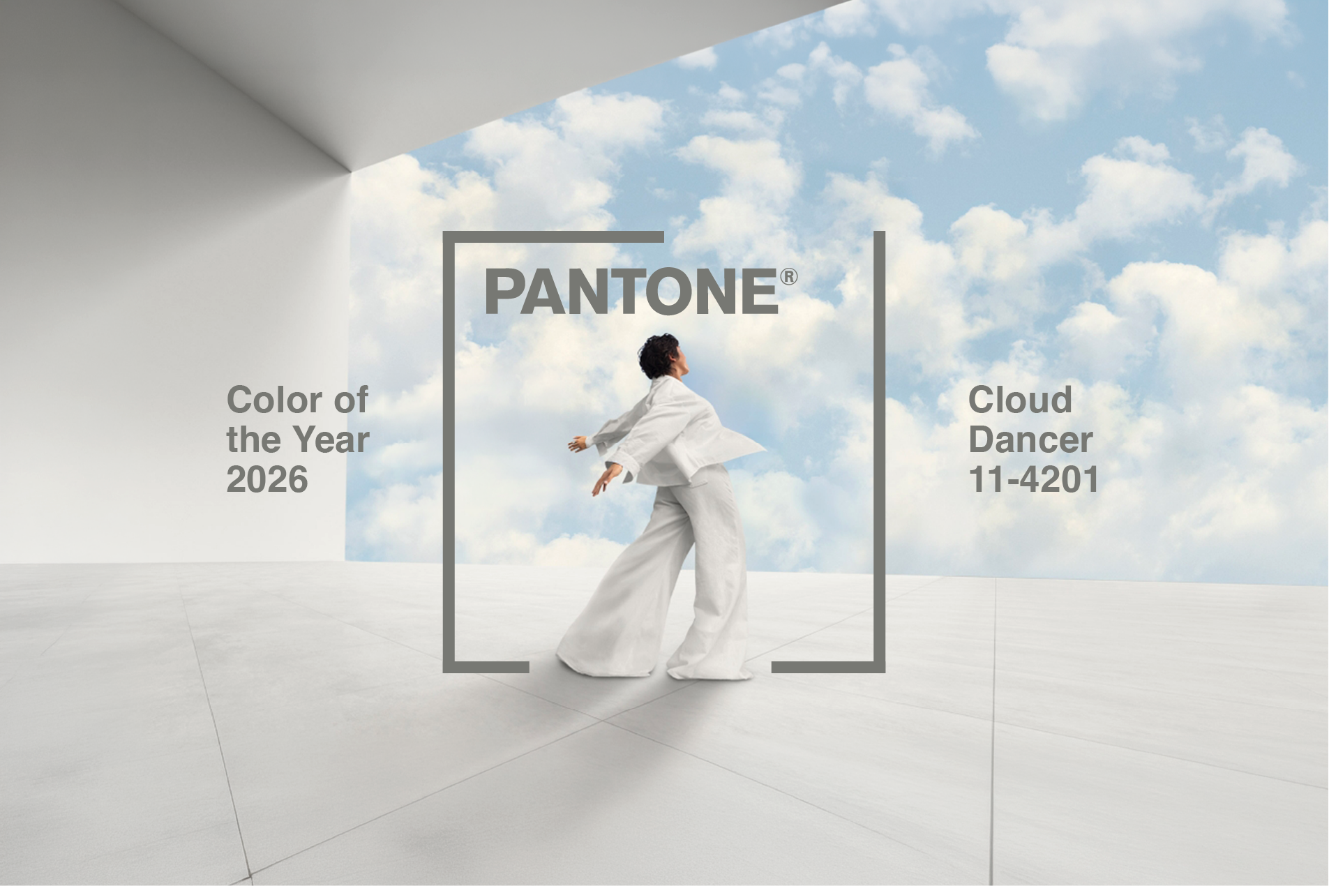
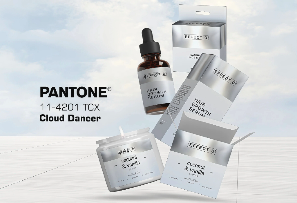
Colour of the year 2026: Cloud Dancer – PANTONE 11-4201
Each year, the Pantone Colour Institute sets the direction for global design. For 2026, PANTONE 11-4201 Cloud Dancer takes the spotlight – a soft, ethereal off-white that signals clarity, calm and intentional simplicity.
Yes, it’s a shade of white. But Cloud Dancer isn’t just another white.
Cloud Dancer represents a meaningful reset. After years of bold colour collisions and hyper-polished visuals, this tone invites brands to slow down. It signals a shift from visual noise to disciplined restraint. In packaging, that shift changes everything.
When Cloud Dancer Makes Strategic Sense
For specialty coffee, premium skincare, craft spirits and elevated FMCG, Cloud Dancer communicates maturity. It shifts luxury away from loud metallics and heavy decoration toward restraint and confidence. In crowded retail environments, louder isn’t always smarter. Sometimes the quietest pack is the one that feels most considered.
Cloud Dancer works particularly well when your message is clear. Because when colour steps back, hierarchy and typography must step forward.
1. When You’re Positioning for Quality and Credibility
If your product sits above average in price – or needs to signal reliability and trust – Cloud Dancer can support that positioning.
This applies not only to premium coffee or craft spirits, but also to categories like skincare, pharmaceuticals, clinics, supplements and wellness brands, where clarity and confidence matter more than decoration. Clean, restrained packaging communicates control. It says: “We focus on what matters. We don’t need visual noise to prove our value.”
In luxury categories, that restraint feels sophisticated. In clinical or wellness categories, it feels trustworthy. Premium brands remove noise to elevate value. Credible brands remove noise to build trust.
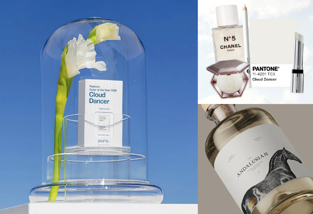
Source: Pura x Pantone of the year 2026 | Beauty News Daily | Deborah Jehlicka Studio
2. When You Want to Communicate One Clear Idea
Cloud Dancer works best when your brand message is focused. If your packaging tries to communicate too many things at once, such as origin, awards, certifications, promotions, flavour notes or sustainability claims, this colour will quickly expose the clutter. But when the goal is to express one clear idea, whether it is purity, craftsmanship, origin, simplicity or quality, Cloud Dancer gives that idea room to stand out. It encourages discipline in the way information is presented.
Instead of competing colours, badges and graphic elements, the design allows a single message to lead. One headline, one visual and one story working together. That clarity makes the brand easier to understand and, just as importantly, easier to remember.

Source: MYNORMALFOODS Brand Identity and Butter Coffee Package
When It Might Not Work
Cloud Dancer may struggle if:
- Your category relies on bright colour blocking (energy drinks, kids snacks)
- You need strong shelf contrast in a very pale category
- Your brand personality is loud, playful or rebellious
In those cases, restraint might feel too quiet.
How to Use It Strategically
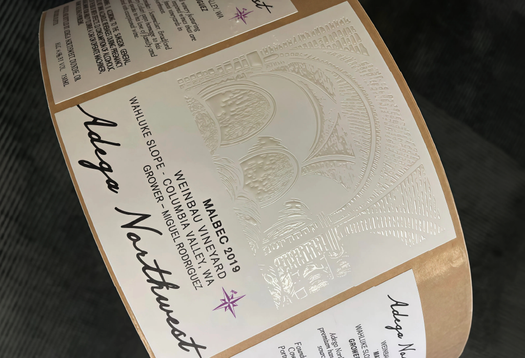
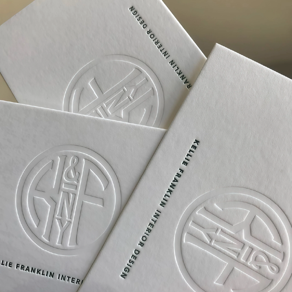
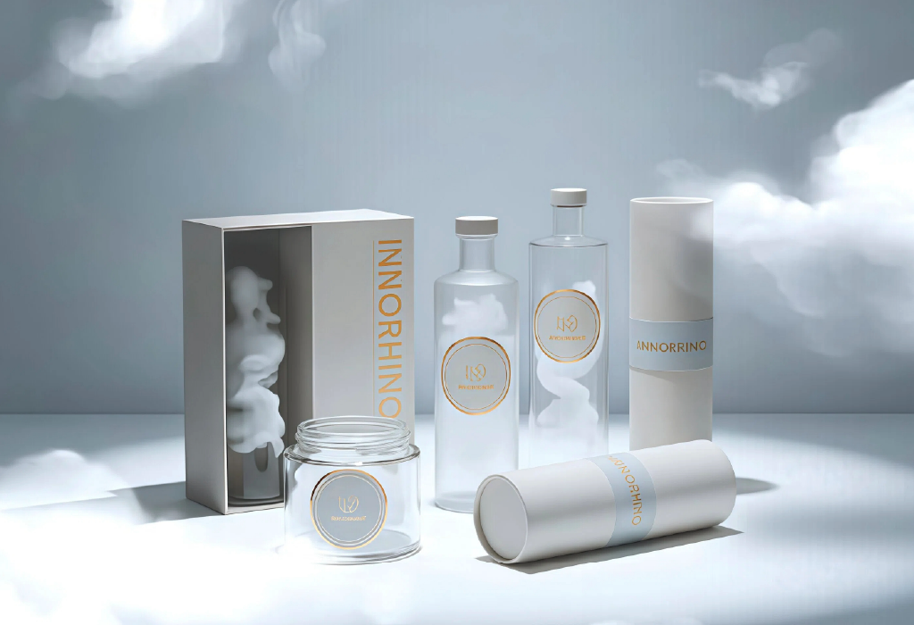
1. Let Material Do the Talking
Cloud Dancer performs best when it’s supported by tactile execution. Soft-touch lamination, uncoated textured stocks, subtle embossing or blind debossing turn the shade into a sensory experience. This is not about flat white ink. It’s about depth, shadow and texture.
From a production perspective, achieving the right off-white tone requires material testing. Slight variations in substrate or laminate can shift it from premium to dull.
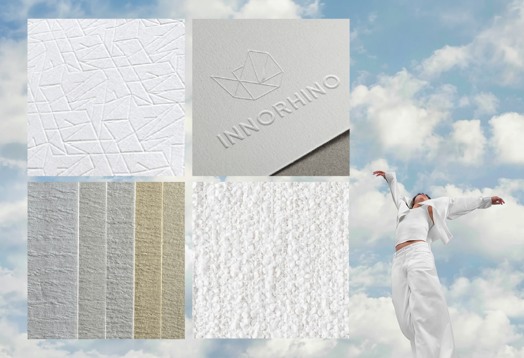
Source: Innorhino
2. Build a Quiet Luxury System
 |
 |
 |
Source: Mammoth Packaging | The Dieline | Paper Meets Press | Box Packaging Solution
Cloud Dancer is the ideal base for quiet luxury.
Strip back excess graphics. Reduce clutter. Allow structure and typography to carry authority. This approach is especially effective for:
- Specialty coffee positioned as origin-led
- Craft spirits leaning into heritage
- Premium FMCG brands targeting modern retail
When executed correctly, the pack feels calm – not blank.
3. Make Contrast Intentional
Because it carries warmth, Cloud Dancer pairs beautifully with:
- Deep black typography for sharp minimalism
- Fine metallic foils for controlled premium cues
- A single bold accent colour for deliberate impact
The key is control. One strong contrast creates elegance. Too many elements destroy the restraint.
Source: Hangzhou Yue Lai Trading Co | Architeg Prints
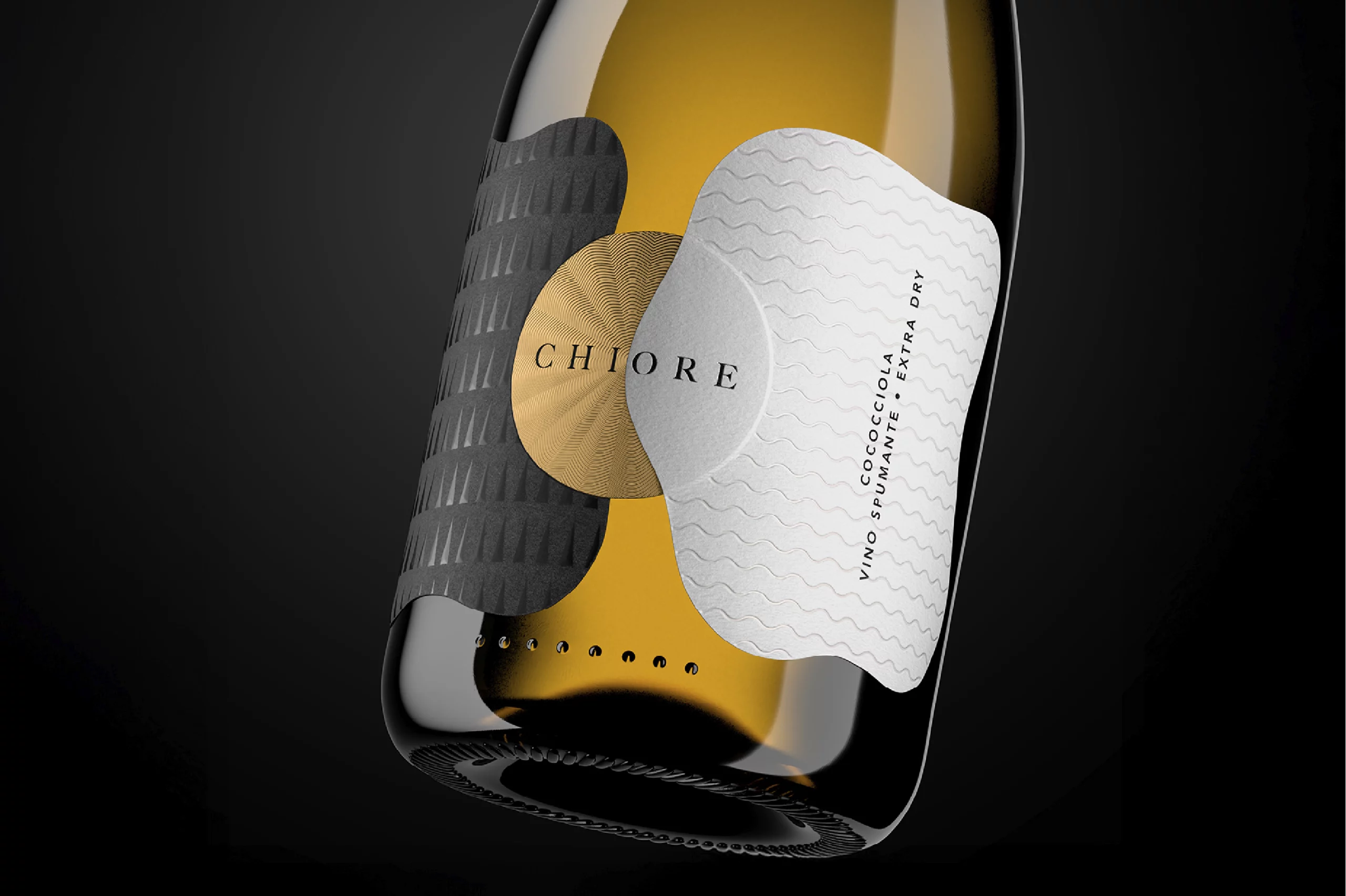
Source: Chiore Packaging Design by daromastudio
4. Design in Layers, Not Empty Space
Cloud Dancer should never feel like “white space.” It should feel like a canvas.
Subtle tonal textures, soft gradients, blind embossing or layered finishes can create depth while preserving simplicity. The most sophisticated executions feel dimensional, even within a monochrome palette.
Source: Innorhino
Which Industries Should Use Cloud Dancer and Where?
Cloud Dancer is not limited to one category. But it works best in industries where trust, purity and craftsmanship are central to the value proposition.
Specialty Coffee & Premium Tea
For origin-led coffee brands, Cloud Dancer creates space for storytelling. It works particularly well for:
- Single-origin releases
- Limited harvest editions
- High-end retail SKUs
- Gift collections
The off-white base allows origin, altitude and farmer narrative to stand out without visual competition. It signals maturity and confidence — ideal for brands moving from “local roaster” to “export-ready premium.”
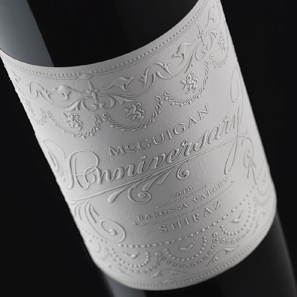
Craft Spirits & Boutique Alcohol
In spirits, Cloud Dancer shifts luxury away from heavy gold and dark palettes toward restrained elegance.
It works well for:
- Small-batch releases
- Heritage-inspired labels
- Premium extensions within an existing range
- Limited collaborations
Instead of shouting prestige, it communicates refinement.
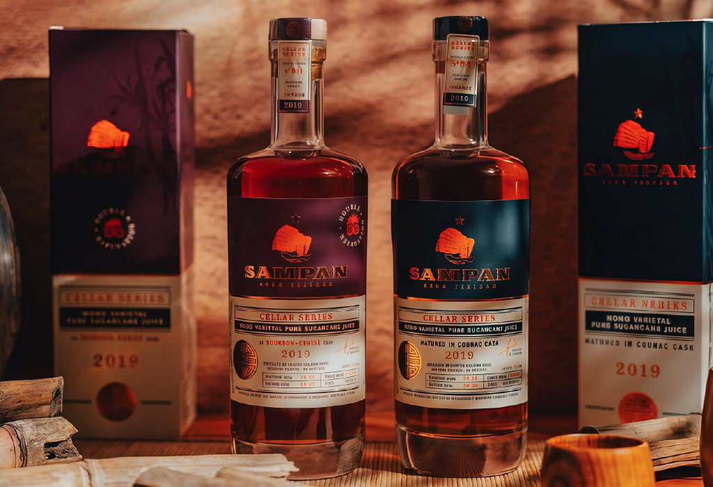
Source: Sampan Cellar Series
Skincare, Wellness & Clean FMCG
Cloud Dancer aligns naturally with:
- Clean beauty
- Minimal formulation brands
- Organic or ethical positioning
- Modern wellness products
The tone reinforces clarity, purity and transparency, especially when paired with simple typography and disciplined hierarchy.
Source: Axiom Print
High-End FMCG & Food Gifting
In gifting, confectionery and artisanal food, Cloud Dancer can elevate perceived value dramatically when combined with texture and subtle finishes.
It works best for:
- Seasonal limited editions
- Premium retail collections
- Corporate gifting lines
- Export-focused SKUs
It turns packaging into an object rather than just a wrapper.
If You’re Moving from Colourful to Cloud Dancer — Where Do You Start?
Shifting from bold, colourful packaging to a refined Cloud Dancer system is not just a colour change. It’s a structural shift. Here’s how to approach it strategically:
1. Start with Hierarchy, Not Colour
Before removing colour, review your visual hierarchy, and ask:
- What is the single strongest message on the front?
- Can secondary information move to the back?
- What can be simplified or removed?
Cloud Dancer exposes clutter. So simplify first, then change the palette.
2. Rebalance Colour, Don’t Eliminate It
For brands with strong visual recognition, moving to Cloud Dancer doesn’t mean abandoning your signature colour overnight. A complete shift can confuse loyal customers and weaken shelf recall.
A more strategic approach is to let white take the lead and your original brand colour as an accent.
Instead of a full-colour layout, introduce Cloud Dancer as the dominant background. Then, retain your signature colour in more control as either:
- A refined dash or underline
- A small colour block behind the logo
- A thin border or stripe
- A subtle highlight for key information
This preserves brand identity while modernising the overall look.
From there, replace some of the lost visual “energy” with material depth. Introduce embossing, soft-touch lamination, matte and gloss contrast or restrained foil accents. These finishes add richness without reintroducing visual noise.
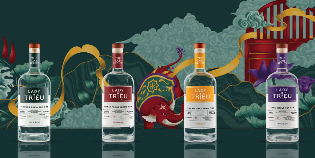
Source: Lady Triệu Sapa Citrus Tea Gin
3. Keep One Strong Anchor
When transitioning from colourful packaging, maintain one of these recognisable elements:
- Logo structure
- Signature typography
- Brand mark
- Shape or format
This ensures customers still recognise you, even if the palette evolves.
4. Test One SKU First
Don’t redesign your entire range at once. Start with a premium line extension, a limited edition, or a seasonal launch.
This allows you to test how the refined aesthetic performs in retail without risking brand recognition.
5. Align Design with Production Early
Off-white tones are sensitive. Substrate, white ink density and lamination affect how Cloud Dancer appears in real life.
Before final rollout, make sure you:
- Test material samples
- Check under retail lighting
- Evaluate contrast at shelf distance
Refinement depends on precision.
Final Takeaway
In simple terms, use Cloud Dancer when you want your packaging to feel confident, calm and considered, not attention-seeking.
This trend is not about removing elements for the sake of minimalism. It is about choosing one clear idea and allowing it to lead. That is the difference between packaging that is visually quiet and packaging that feels intentionally refined.
But refinement requires expertise. The line between intentional minimalism and unfinished packaging is thin. It depends on hierarchy, typography discipline, material choice and print precision. Off-white tones are unforgiving and they expose imbalance instantly.
That’s why design and production must work together.
At Thirsty Fox, we approach Cloud Dancer as a strategic decision – defining structure, brand positioning and visual clarity before colour is ever applied. At QLM, production expertise ensures that the chosen white behaves exactly as intended across substrates, laminates and finishes – so it feels premium in real life, not just on screen.
When design intelligence and print execution align, Cloud Dancer doesn’t look plain. It looks deliberate.
And in 2026, deliberate brands don’t just look confident – they perform confidently on shelf.
If you’re considering refining your packaging for 2026, our team at Thirsty Fox can guide the strategic direction and 3P Systems & QLM ensures the execution delivers exactly what was envisioned.